Moving over to the second part of the interface, the image preview area. There are a series of buttons down the left hand side. Starting at the top; Information about release etc. just click on any button when the info screen appears and you are not only given the information about your release, but also a horrible ditty tune that sounds like it was recorded outside a cafe in Latin America - a certain guarantee that you will never look at this page again. Next button is a Help, the quick start manual in PDF format. On the topic of manual, there is an excellent all colour printed manual with the software. Rotate button, this rotates the entire screen rather than individual frames. Flip horizontal and vertical button, Scan Pilot. this is a workflow button which launches the Blue Auto Pilot - a step by step walk through for scanning.
The job manager button is a convenient way to perform batch scanning, simply add the images you want to the job list and apply the settings. The Dust and scratch removal feature in SilverFast is perhaps the weakest element, once you have used Fare or Digital ICE then nothing else will do. I found this to be cumbersome and it was often quicker to retouch in Photoshop, especially with the new spot healing brush in CS2. The next button is delete frame, this can also be achieved quicker by simply pressing the Delete key on your keyboard. Pressing the Delete frame button or the Delete key, brings up a message saying are you sure you want to delete all the previews and frames - hang on the button says delete the current frame! This button needs looking at. Moving down one, the next button has three functions, click on the left side and you can see where the brightest and darkest parts of the image are, click on the right and you can see the frame numbers. The next button down is a print button - should you want to print directly from your scanner that is. Finally there is another Quick Time video tutorial button - I am begriming to like like Karl's soft voice, especially at 00.32 am. Quips aside, this interface is slick and will get you productive in no time at all. Karl provides plenty of useful information throughout the interface.
 |
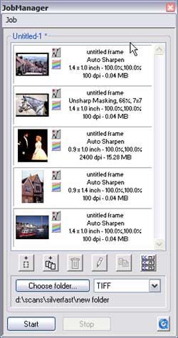 |
| Auto Pilot and function buttons | Job manager |
The Colour Correction buttons
Along the top row are a colourful set of buttons.

The First button is the zoom tool, click on this to preview a selected frame at a magnified level, you can't set this, but it is more than sufficient. The next button is the auto adjust button, this optimizes the highlight, midtone and shadow areas. The button also changes colour when you have colour management options set. The next two buttons launch the Histogram-Levels and the Gradation Curves.The Histogram can be viewed in CMY or RGB, as individual colours or combined as shown below. The curves can also be viewed in CMY or RGB and has very fine control. I achieved good results from using the curve adjustments, you can save your settings. The curves can be adjusted via the sliders below or by grabbing the curve itself. Moving the sliders gives you an instant result, whether its a contrast or brightness increase or an overall darkening, you could use this as a starting point before fine tuning the picture with the actual curve.
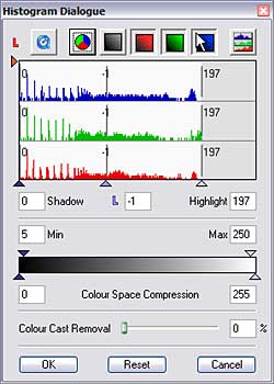
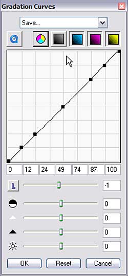
Histogram - Levels or Curves take your pick, both methods produced good control on the image
The next two buttons enable you to fine tune your colours.
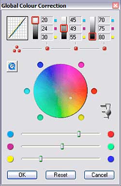
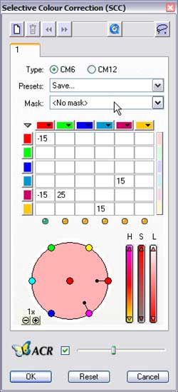
Don't be overawed by these settings, they really are very easy to master
The Global colour correction panel is very similar in function to the Colour Balance filter in Photoshop. The sliders on the bottom move from Cyan to Red, Magenta to Green and Yellow to Blue. At the top is basically the Shadow, Midtone and Highlight settings. click on the red buttons to select your level and move the sliders. You can also grab the white dot in the spectrum wheel and drag it about - watch the bottom sliders as you do this the whole panel reminds me of a billiard table with balls all over the place. The next pallet is the Selective colour correction. Click on a colour in your preview window and the circle changes to the colour you just clicked, from here you can adjust the Hue Saturation and Lightness by either dragging the edge dots inwards or by adjusting the sliders on the right. You can also enter numeric values in the grid above. So if you wanted to add some more Magenta to your blue just add a value in the cell where the blue and magenta meet - on the sample above I added 25 magenta to reduce the green in an image. The previews update themselves instantly so you can see what is going on all the time with all the adjustments. The ACR (Adaptive Colour Correction) is for adjusting the overall colour saturation.
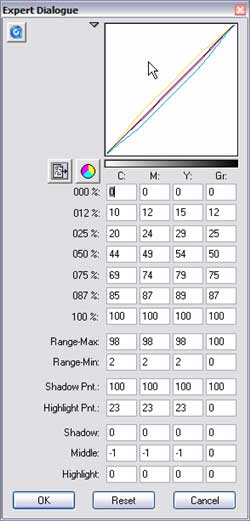
I will deal with some of the other functions as I progress, but will briefly mention the button with the eyedropper in it. Click on the White triangle and then click on a white in the image to set your highlight, there is also a grey and black option. The last button launches a complex looking palette - this is the expert dialogue settings whereby you enter numeric values to adjust the tonality of your image. Karl adds his dulcet tones to explain the functions.
 |
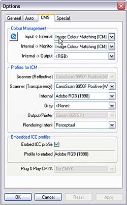 |
| For Experts and accountants only | Colour management guru's will love this |
Next the scans
(Source: photo-i, Vincent Oliver, 2005)
 English
 Deutsch
 Français
 Italiano
 日本語
日本語 Español
 Português
 Russian
 Chinese (Simp.)
 Czech
Czech Polish (Store only)